Article

Series labels in a Line chart in Power BI

Series labels in a Line chart in Power BI


A.Baddane | Posted on Sept. 23, 21

   In September 2021 Power BI update, you can Create and format series labels in a Line chart, this option will allow users to distinguish which line is associated with which categories

The following steps describe how to create series labels:

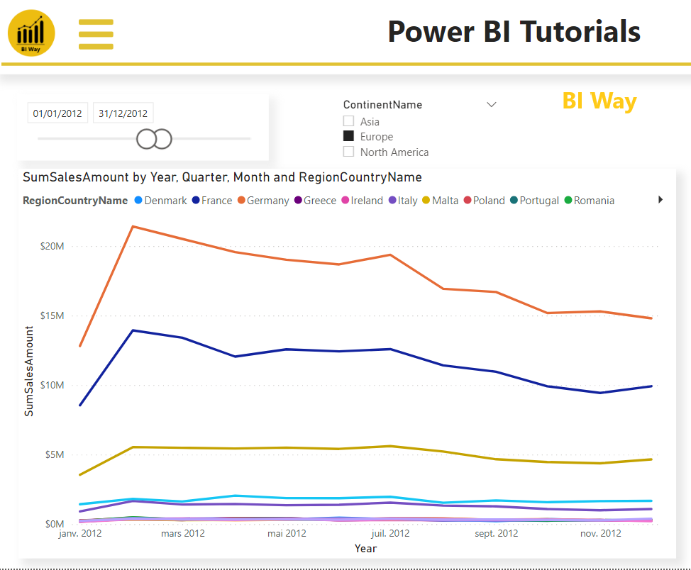
  • Create your line chart visual and add a legend

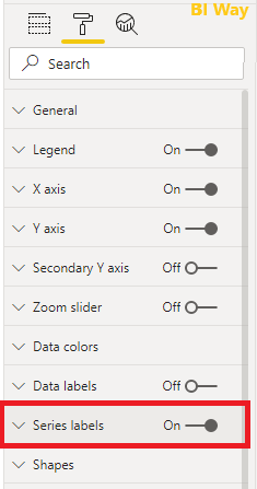
  • Select the visual, in the formatting pane, turn on the series labels option

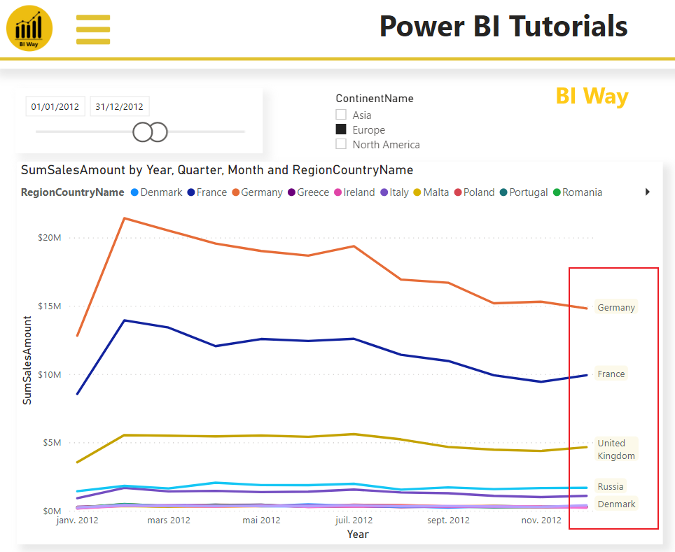
After activating the series labels option, the labels appear on the right side of the series categories of the line chart

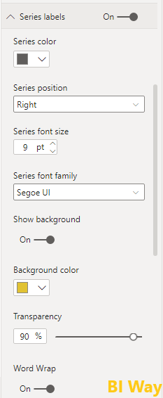
  • You can add formatting to the labels such as color, background color, size, word wrap and more


By using serial labels, users will get a better view when viewing the line chart.


Related Video:


(0) Comments

There is no comment

Leave a Comment
Add to favorite
Categories
Recent Posts
Filter column based on a list in Power Query
A.Baddane | April 05, 23

Sometimes when you work within power query, you need to filt...Read More


Use HTML in Power BI - Part 2
A.Baddane | July 05, 22

In the first blog post about using HTML in Power BI Desktop,...Read More


Use HTML in Power BI
A.Baddane | Feb. 21, 22

In this blog post, I will show you how to use HTML to create...Read More


Covid-19 Report
A.Baddane | Nov. 23, 21

The COVID-19 pandemic, also known as the coronavirus pandemi...Read More